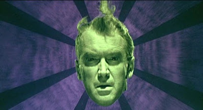
Click on the full-screen button (at the bottom right
of the video), to make the video nice and BIG!
of the video), to make the video nice and BIG!
There’s no real room for the character to move, so the audience can focus on the expressions and emotions of the characters. The way characters act and react is always very important to understanding the story.
A common mistake of less experienced storyboard artists is framing their shots too tightly. Even a close-up should have a bit of breathing room, unless it is the rare occasion of an extreme close-up.
This also has to do with pacing... it's best to save those high-impact shots were the moments in the story that have the greatest impact.
If a storyboard artist were to fill their board from start to finish with lots of crazy angles, fancy camera moves and extreme close-ups, it would leave no room for the artist to show any real impact when it's really needed. It's all about contrast.

Questions or comments?
I'd love to hear from you in the comments section below!
--------------------------------------------------
Other posts in this Storyboarding Commentary series:


No comments:
Post a Comment